The aesthetic beats of a digital interface primarily rely on the precise blend of design and typography. Typography, an essential aspect of UI/UX design, holds the power to make or break a design. In the world of digital interfaces, it bounces as a vital communication tool that enhances readability, user experience and drives user engagement. This article explores the importance of typography for digital interfaces in detail.
Importance of Typography in Digital Interfaces
The prominence of typography in digital interfaces is often undervalued, and here's why it shouldn’t be overlooked:
Readability: Precise typography ensures clear and straightforward delivery of content, making the interface easy to comprehend.
Brand Identity: Typography greatly influences your brand's perception and personality, making it more relatable and visually appealing.
User Experience: The correct use of typography enhances the overall website ambience, giving the users a satisfying experience.
Attention Grabbing: Striking and attractive typography has the power to hold the attention of the viewers, thereby reducing the bounce rate.
Key Elements of Digital Typography
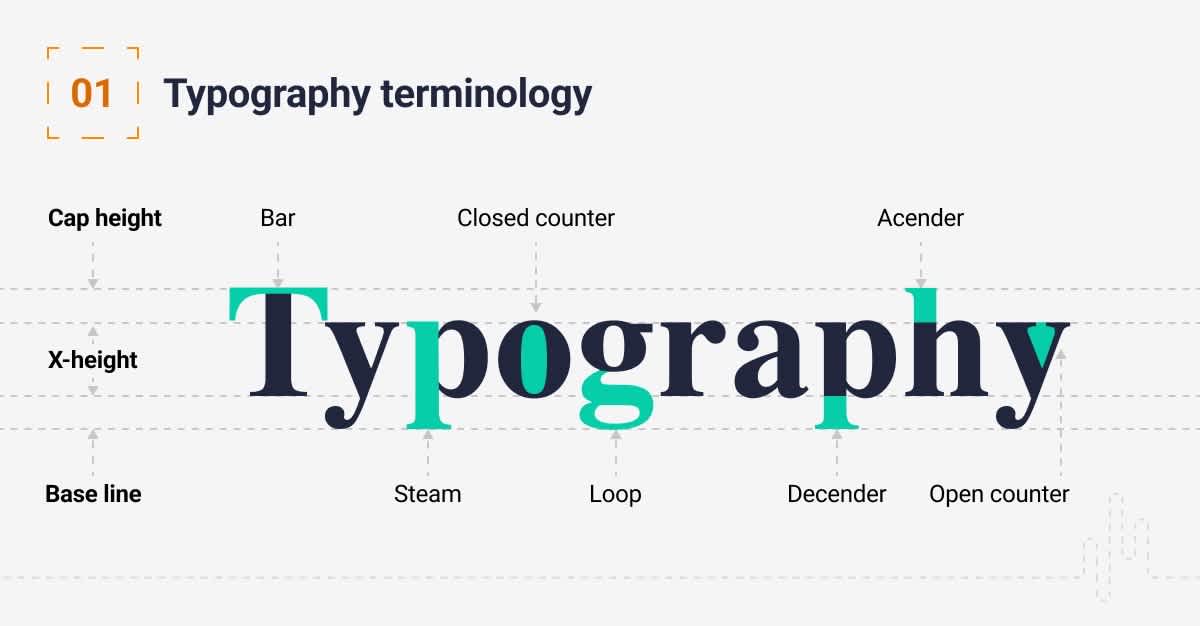
Typography may seem simple but lurking underneath is an intricate science. Let’s delve into the key typographic elements:
Typefaces and Fonts
Confusingly interchanged in conversation, typefaces and fonts are actually different. A typeface is a family of fonts (for example, Arial), and fonts are the variations within the family (Arial Bold, Arial Italic, and so on).
Serif and Sans-Serif Fonts
Serif fonts are those with small lines or strokes attached to the ends of larger strokes in a letter or symbol. A popular example of this is the Times New Roman font. On the flip side, sans-serif fonts have no such strokes, and Arial is a popular pick.
Tracking & Kerning
Tracking refers to the overall space between a group of letters to affect the density in a line or block of text. Kerning is quite similar but it deals with adjusting the space between two specific letters.
Leading
Leading plays a crucial role in enhancing the readability as it deals with the space between the baseline of successive lines of type.
Hierarchy
Hierarchy creates a differing visual significance between items, allowing the readers to navigate easily and leading them towards the most crucial elements in the content.
How to Choose the Right Typography for Digital Interfaces
When it comes to selecting the right typography for digital interfaces, several factors need consideration. Here's a guideline to ease your process:
Understand the Brand Personality: The typography should align with the brand personality. For instance, a modern and minimalist brand might opt for simple and clean sans-serif fonts.
Readability and Accessibility: Select typography that enhances readability and accessibility, crucial for engaging the users. Try different font combination tools available online.
Consider the Audience: The selection of typography heavily depends upon the target audience. Older demographic may appreciate larger, cleaner fonts, while a younger crowd could be attracted by modern, trendy typography.
Consistency: Consistency goes a long way in presenting uniformity across your website, enhancing the brand impression.
Testing: Different fonts may render differently on different screens. Make sure to test the fonts across various devices and browsers for consistency.
Frequently Asked Questions about Typography For Digital Interfaces
What are the main elements of typography in digital interfaces?
The main elements of typography in digital interfaces include typefaces, fonts, point sizes, line lengths, letter spacing, and line spacing. Other crucial elements include contrast, color, hierarchy, and consistency.
How can I choose the right typeface for a digital interface?
Choosing the right typeface depends on several factors, including your brand personality, the content of your site, your audience, and the device on which the content will be viewed. Fonts should be legible and clear on all screen sizes and resolutions, conveying the right emotion and message to the audience.
What is the role of color in typography for digital interfaces?
Color plays a significant role in digital interface typography. It not only sets the mood and tone of the interface but also influences user perception. It’s important to use color effectively to guide users, indicate interactive elements, and maintain visibility for legibility.
How do I ensure legibility while designing typography for digital interfaces?
Legibility in typography for digital interfaces can be ensured by proper font size selection, appropriate letter and line spacing, as well as high contrast between text and background. Using simple and clean fonts, keeping a proper line length and maintaining a good visual hierarchy can also increase legibility.
How does typography impact user experience?
Typography impacts user experience on multiple levels. It guides users through the interface, influences the perception of the content, and plays a role in usability and comprehension. Effective typography can create a positive and engaging user experience that makes interfaces intuitive and enjoyable to use.
What is responsive typography in the context of digital interfaces?
Responsive typography refers to text that is adaptable across different devices and screen sizes. For a pleasant reading experience across all platforms and devices, typography needs to adjust based on the user's device. This can include changes in font size, line height, and line length, among others.
How do I create typographical hierarchy in a digital interface?
Creating a typographic hierarchy involves designing text in a way that clearly conveys the importance of each element on the screen. This can be achieved through variations in type size, weight, color, and placement. A good typographic hierarchy helps guide users through your content, making the interface easy to navigate.
What are best practices for pairing fonts in digital interface typography?
When pairing fonts, it's important to choose typefaces that complement each other and create a balanced and harmonious look. Using too many different fonts can lead to a cluttered and confusing interface. A good rule of thumb is to stick with two to three fonts - one for headers and one for main text, perhaps another as an accent font.
Pros of Typography for Digital Interfaces
Enhances User Experience
The application of good typography on digital interfaces can dramatically elevate the user experience. A strategic approach to typography allows viewers to navigate the platforms seamlessly. Users can effortlessly consume the information they are searching for, reducing cognitive efforts and enhancing user retention.
Improves Readability
Considerate typeface selection and ratios can greatly improve the readability of your content. A better readability quality drastically reduces eye strain, especially for long text paragraphs.
Influences Perception
Typography enables you to influence user perception subtly. Fonts trigger emotional responses and can set the tone for your brand. A well-selected font can reassure users of your brand's authenticity, professionalism, and reliability.
Facilitates Visual Hierarchy
Through typography, you can guide a viewer by defining content priority using visual hierarchy. Headers, subheadings, and body text have different font sizes and weights presenting parts of the content as more prominent than others. This aids users' attention to more important data.
Enhances Aesthetic Quality
Good typography can improve the aesthetic quality of a digital interface. Whether you go for a minimalist or bold impactful design, typography can help pull off any desired look and feel. This can greatly enhance the overall appearance of the platform, making it more inviting and engaging.
Assists Brand Reinforcement
Each typeface carries its distinct personality, and they can embody the values of your brand, aiding in brand reinforcement. Persistent use of certain typographic styles will imprint a strong lasting image of your brand in users' minds.
Cons of Typography for Digital Interfaces
Increased Complexity
Having to meticulously choose each font type, size, color, spacing can get complex and time-consuming. The task requires knowledge and expertise in typography principles. Improper use can lead to a poor user experience defeating the purpose of the application.
Can be Expensive
Certain high-quality typefaces and fonts are expensive and require licensing. Small businesses and startups on tight budgets may find this quite demanding, limiting their options.
Compatibility Issues
Not all fonts are adaptable on all devices, platforms, and browsers. Sometimes, the font may appear distorted or be replaced with a default font, disrupting the interface appearance and user experience.
Load Time
More complex and decorative fonts can slow down page loading times adversely affecting user experience, especially for users with slow internet connections.
Overuse of Trendy Fonts
Trends in typography keep changing and riding the wave might affect the consistency in digital products or services. Overuse of trendy fonts can distract and over-complicate the user interface with unnecessary elements.
Risk of Diluting Brand Identity
Without intentional strategies to maintain a consistent typographic style across all platforms, there's a risk of diluting the brand identity. Consistency in typography is paramount for strong branding; failure to maintain this can result in a weak brand image.
Potential Accessibility Issues
Different users have different levels of visual acuity. If the typography isn't accessible, users with visual impairments may struggle to consume the content. Hence, it is crucial that digital typography should cater to users with different accessibility needs.
Summary
All said and done, Typography for digital interfaces plays a crucial role in the user experience. Its impact extends beyond just aesthetics; it can influence user behavior and engagement too. A fundamental understanding of typography can make a significant difference in how users interact with your interface, guiding them through a journey by making content more readable, accessible, and engaging.
Improper use of typography can quickly make a system difficult to use or comprehend. So, it's not just about picking the right font or size, but also about balancing all elements to ensure clear communication. It's about how typography implements hierarchy, space usage, alignment, and legibility to boost the overall user experience on digital platforms.
Finally, remember that typography for digital interfaces is not a set-it-and-forget-it deal. It requires continuous tweaks and testing as your user base or platform evolves. Whether you're a seasoned designer or someone just starting, keep learning, experimenting, and revising to get a handle on how typography can essence every feature of your digital interface.
About WebPerfex;
WebPerfex is a thriving digital marketing and web design company based out of Roseville, CA. Known for our unique strategies and superior skills in SEO, we've carved out a niche in boosting online visibility for businesses. Our exceptionally talented team is passionate about all things digital and has mastered the art of creating beautifully designed, highly functional websites that drive traffic and generate leads. We're not just all about business; the friendly atmosphere and chilled-out vibe at WebPerfex reflect our emphasis on creativity, collaboration, and maintaining a healthy work-life balance. We continually strive for excellence and are committed to delivering top-notch digital solutions to our clients.


