In a marketing world where grabbing consumers' attention is paramount, the importance of an engaging and memorable logo design cannot be understated. Ambitious businesses, regardless of size or industry, go lengths in creating logos that lyrically represent their brand's core identity. This article elucidates the modern logo design trends, thereby providing a bird's-eye view on what to consider to keep your business relevant.
Minimalism: Simplicity Speaks Volumes
Maybe it's the overexposure to visual complexity or perhaps the appreciation of "less is more", but minimalistic logos have been the belle of the ball in recent times. Minimalistic designs are clear, concise, practical, and most importantly, memorable. The digital arena prefers simplicity, as simple logos are easily scalable for various platform uses.
- Popular brands that favor minimalism: Google, Nike, Apple
Responsive Logos: The Trend of Adaptability
Responsive logos are the chameleons of the design world, adapting to different screen sizes and applications. This trend reflects the need for logos to be versatile and responsive across all possible digital platforms.
- Brands with responsive logos: Disney, Chanel, Gucci
Negative Space: Clever Use Of Voids
Playing around with negative space might be an old trick, but it never fails to impress. By creatively using the empty or negative space, logos can reveal extra layers of meaning, drawing viewers' attention and making the logo more memorable.
- Brands using negative space brilliantly: FedEx, The Guild of Food Writers, NBC
Hand-Drawn Logos: A Human Touch
Hand-drawn logos have emerged as a refreshing trend, specifically aiming at humanizing brands. These logos, often created in free-form typography or with imperfect lines, radiate warmth, personalization, and originality.
- Examples of hand-drawn logos: Script Kitchen, Ruffles, Puma Hoops
Animated Logos: Adding Life to Brands
Animated logos aid in storytelling, engaging the audience in a memorable way while leveraging the dynamic nature of motion graphics. From simple tweaks to complete transformations, animations can add depth to a logo's presentation.
- Popular brands with animated logos: Fendi, Dior, Microsoft
Gradients: Adding Depth and Intrigue
Gradients have been around for years, but their application in logo designs has seen a significant resurgence. Gradients offer the possibility to project a vibrant, modern, and stylish image, making logos attractive and attention-grabbing.
- Brands beautifully employing gradients: Instagram, Spotify, Visa
Overlapping Elements: Art of Layering
Overlapping shapes or elements in logo designs create interesting visuals that can stimulate viewers' imagination. These overlapping areas can potentially suggest unity, togetherness, or blurring boundaries.
- Brands with overlapping elements in logos: MasterCard, Airbnb, Olympic Games
Geometric Shapes: Strength in Simplicity
Geometric shapes, with their clean-slashed edges and defined appearances, provide a visual anchor and structure to logo designs. Circles, rectangles, squares, or more complex shapes can embody stability, power, and professional appeal.
- Examples of logos with geometric shapes: Microsoft, Adobe, IBM
Frequently Asked Questions about Modern Logo Design Trends
What are some of the current modern logo design trends?
Some of the current modern logo design trends include minimalistic design, flat design, hand-drawn logos, negative space logos, gradient logos, vintage logos, and geometric shapes. Minimalistic design refers to simplified, uncluttered logos often featuring basic shapes and limited color palettes. Hand-drawn logos are unique, personal, and convey a sense of authenticity that many brands are striving for. Gradient logos use a smooth color transition technique to create a vibrant, modern feel. Geometric shapes are used for their versatility and ability to convey complex concepts through simple forms.
What is the role of color in modern logo design trends?
Color plays a crucial role in modern logo design trends. Different colors can evoke various emotions and responses from consumers. For example, red can symbolize excitement or urgency, while blue can convey trust and stability. Therefore, choosing the right color scheme is integral to creating a logo that accurately represents your brand's identity and message. Current trends lean toward bold and bright colors, pastel hues, or purely monochrome designs.
What is the significance of minimalism in modern logo design trends?
The minimalism trend in logo design evolved from the "less is more" rationale. Modern consumers appreciate simplicity and visual clarity, which is exactly what minimalist logos deliver. Despite being seemingly simple, minimalist logos demand expertise and creativity to create memorable, effective design elements. Minimalism involves stripping away unnecessary details to focus on the brand's core identity, making it a popular choice in modern logo design trends.
Can you explain what negative space logos are?
Negative space logos are a creative and smart use of the space that surrounds an object in an image. In logo design, negative space can be used to create additional, often hidden, images or messages. This technique is appreciated for its cleverness and ability to engage viewers, making it a trending choice in modern logo design scenarios.
What makes hand-drawn logos popular in modern logo design trends?
Hand-drawn logos have gained popularity in modern logo design trends due to their ability to portray authenticity, personal touch, and human connection. They can take on a diverse range of styles – from clean and elegant to rough and sketchy. As brands increasingly strive to stand out and establish unique identities, hand-drawn logos offer a level of originality that pre-made icons or fonts simply cannot provide.
How have technological advancements influenced modern logo design trends?
With the rise of digital technology and online marketing, logo designs have evolved to be more dynamic, flexible, and interactive. Brands are now creating responsive logos that can adapt to various digital platforms without losing their core design elements. 3D designs and animated logos are also becoming popular as these provide a unique, engaging visual experience to the audience. The health tech, gaming, and entertainment sectors particularly seem to leverage these modern logo design trends extensively.
What goes into creating a versatile logo in line with modern logo design trends?
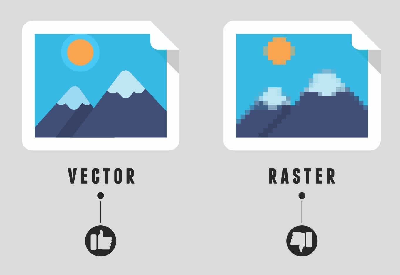
Versatility is a key factor in modern logo design trends. A logo must be able to maintain its integrity across various platforms, dimensions, and backgrounds, whether it's on a website, a social media profile, a billboard, or a business card. Some elements of a versatile logo include simplistic design, clear fonts, recognizable imagery, and adaptable color schemes. It’s always wise to design logos in a vector format to ensure scalability without losing quality.
Pros of Modern Logo Design Trends
Enhanced Simplicity
Easy Recognition
One of the most significant advantages of modern logo design trends in 2022 is the push for simplicity. Simple designs are typically easier to recognize and remember. With less detail to process, audiences are more likely to identify and recall a brand.
Flexibility Across Platforms
The minimalist trend works well in an increasingly digital world where logos must fit on various sizes and types of screens. A simple design can scale up or down without losing any detail, thus ensuring consistency across all platforms. It's great for responsive web design, app icons, and social media profiles where space can be limited.
Use of Negative Space
Building Depth and Dimension
Negative space is the unoccupied area or blank space around an object. Using this technique, designers cleverly integrate an image or a message within this space, adding more depth and dimension, and making the logo more intriguing and memorable.
Dual Interpretation
This also allows for dual interpretation, where the image seen depends on whether the viewer focuses on the subject or the negative space around it. It leaves room for creativity and can often lead to innovative and exciting designs that stick in people's minds.
Color Gradient
Vibrant Look
Color gradients are a trend that adds vibrancy to a logo. It helps create a soft transition between hues, giving depth to flat designs, and making logos more appealing and less static.
Visual Hierarchy
Gradients can also help set up a visual hierarchy, which directs the viewer's eye to the most important elements of your design based on color and shading differences.
Cons of Modern Logo Design Trends
Simplicity May Lead to Generic designs
Lack of Unique Identity
While simplicity is beneficial in many ways, it has a downside when it comes to individuality. With a focus on minimalism, many logos can end up looking very similar or too generic, leading to a lack of uniqueness for the brand identity.
Over Attention to Simplicity
If taken to an extreme, the trend towards simplicity may result in a logo being so pared down that it loses any real connection to the brand it's meant to represent. There's a fine line between being purposefully minimalist and being overly simplistic.
Use of Negative Space May Cause Confusion
Misinterpretation
While the dual interpretation provided by the use of negative space can be powerful, it can also be confusing. If the hidden message or image is too subtle or obscure, it may not be noticed, or even worse, it could be misinterpreted.
Complexity
Despite its name, negative space isn't for everyone. Designing a logo that uses negative space effectively can be a complex process that requires creativity and expertise. Not all designers have experience with this technique, so it might not be an option for every business.
The Trendiness of Color Gradients Could Fade
Limitations in Printing
While color gradients might look great on digital screens, they can be challenging to reproduce accurately in print. Large gradients may not print smoothly, resulting in a banding effect, which may not be ideal for businesses that rely heavily on printed marketing materials.
Short-lived Trends
Although currently popular, like any trends, gradients might not stand the test of time. Investing in a gradient-based logo today may require an update in a few years when the trend fades, meaning there's less longevity in this design choice.
Summary
To sum it up, modern logo design trends have massively evolved in the past years, reflecting our rapidly altering era. Trends like minimalism, vintage aesthetics, and 3D designs provide a wide range of options from which designers can choose to create unique and impactful representations of branding and identity. These trends don't just reflect the visual culture of a time; they also help construct it, pushing forward the boundaries of creativity and reimagination.
So, as we see, modern logo design trends are not only defining a brand's identity but also creating a bridge of understanding and connection with the audience. By learning and understanding these trends, designers can make conscious choices about how to make their work stand out and stay relevant. But always remember, while trends can be cool and unique, a truly impactful design always emanates from the core values and goals of the brand.
Lastly, as modern logo design trends continue to evolve, it's clear that their effectiveness lies in their adaptability. These trends provide a window into future possibilities and opportunities for designers to step beyond the ordinary and create something truly memorable and iconic. Designers who can balance incorporating current trends with a timeless design aesthetic will succeed in creating logos that not just identify a brand, but also tell its story, its mission, and its vision.
About WebPerfex;
WebPerfex is a kick-ass team based in Roseville, CA, on a mission to take your brand's online presence to new heights. We're not just another run-of-the-mill digital marketing agency; we are a unique mix of hustle, creativity, and strategic vision. We specialize in website design, search engine optimization, and graphic design but we don't stop there. Our crew is skilled in the fine art of everything digital. We're all about turning your vision into reality and driving the results you desire. Simply put, we're experts in making sure your brand gets noticed in the vast digital landscape. Trust us, you're in good hands with WebPerfex.


