Harnessing the power of minimalist graphic design can imbue your work with timeless sophistication. This specific style of design, centered primarily around the concept of simplicity, is becoming increasingly popular in the modern world, both in design circles and among everyday users. Let's delve into the realm of minimalist graphic design and explore its guiding principles.
What is Minimalist Graphic Design?
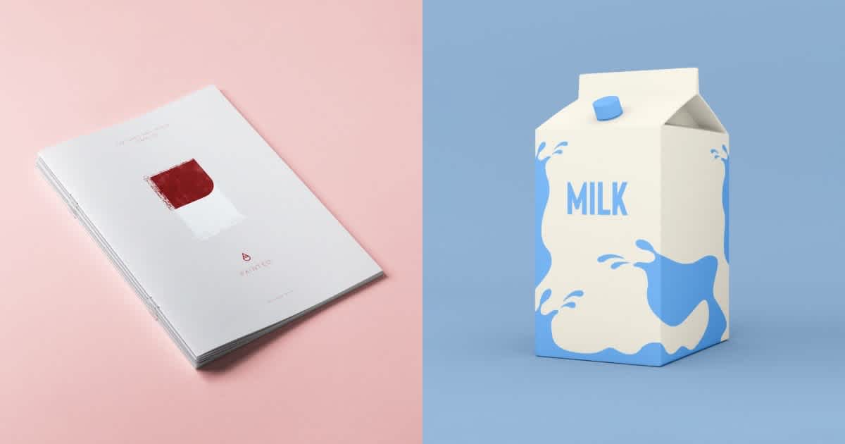
Minimalist graphic design is an approach that simplifies the visual components of a design to convey a clear, straightforward message. It discards unnecessary elements, focusing on only the essential elements such as color, typography, and white space. Aesthetic rigor and functionality lie at the core of minimalist design.
The Bedrock of Minimal Design: Less is More
The minimalist design follows the adage, 'Less is More,' which implies stripping down design components to expose the primary essence. The notion is not to create something barren or dull, but to distill the design into its most fundamental features.
Principle 1: Simplicity
In minimalist graphic design, simplicity rules. Below are some key elements that reflect simplicity:
- Restrained color palettes: Limit your design to two or three complementary colors. Don't overdue gradients and complex shades.
- Flat textures and patterns: Sleek, flat textures promote simplicity. Avoid intricate or cluttered patterns.
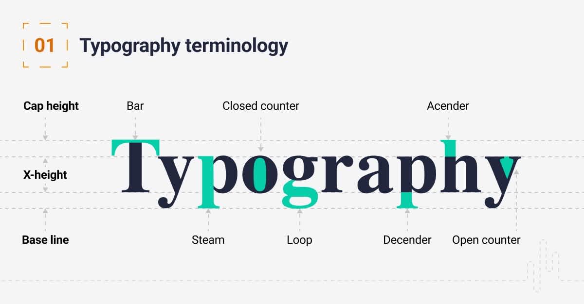
- Clear typography: Stick to straightforward and readable fonts. Refrain from using more than two or three font types per design.
Principle 2: Functionality
Every component incorporated should boost the design's overall functionality. This implies:
- Smart use of white space: Done right, white space can guide the viewer’s eyes and draw attention to important aspects of your design.
- Intuitive navigation: The design should guide the viewer's eyes and make it easy for them to interact with it.
Principle 3: Emphasis on Typography
Minimalism often uses typography to grab the viewer's attention and convey a strong message. Tips for using typography in minimalist design include:
- Contrasting font types: Use different font types to create visual interest. For example, combine serif and sans-serif fonts.
- Playing with font size and weight: By altering the font size and weight, you can emphasize important information.
Principle 4: Color and Contrast
Even though minimalist design commonly uses a limited color palette, this doesn't mean color and contrast aren't important. They can:
- Highlight primary elements: Use color to highlight the key elements of the design.
- Create depth: Contrast can create different layers within the design.
Mastering the Art of Minimalism
To master minimalist graphic design, consider engaging in practice and experimentation. However, always bear in mind the guiding principles:
- Always prioritize the content: Every design decision should serve and enhance the content, rather than dominate it.
- Respect the white space: Learn the balance between filled and empty space. Respect the emptiness, as it is as crucial as the content itself.
- Be consistent: Inconsistency can lead to confusion. Establish a simple rule set and stick to it throughout your design.
- Emphasize the visuals: If you use imagery, emphasize them. They should steal the spotlight.
- Simplicity, not boring: Minimalism is about simplicity, yes. But not boredom.
Frequently Asked Questions about Minimalist Graphic Design Principles
What are the key principles of minimalist graphic design?
The key principles of minimalist graphic design include simplicity, functionality, and subtlety. Other significant elements include the use of limited color palettes, strong typography, white space, and a strict focus on the content and core message. The idea is to create a clean, crisp, and practical design that communicates the intended message in the simplest way possible.
What does 'white space' refer to in minimalist graphic design?
In minimalist graphic design, 'white space' (also known as negative space) refers to the empty space in a design. It doesn't necessarily have to be white, but it's typically devoid of content or visual elements. White space plays a pivotal role in minimalist design by bringing attention to the central design elements, improving readability, and giving a design balance and structure.
Why is typography important in minimalist graphic design?
Typography is essential in minimalist graphic design because it carries the design's primary message. Given the minimal use of visual elements, designers need to rely heavily on the choice of font, type size, line height, spacing, and hierarchy to convey the intended message effectively. A well-considered typographical approach can lead to a sophisticated and effective minimalist design.
Why are color schemes vital in minimalist graphic design?
Color schemes play a crucial role in minimalist graphic design as they often take the center stage in the absence of multiple design elements. Minimalist design usually adopts a monochromatic or limited color palette which aids in making a design feel unified, harmonious, and less cluttered. Therefore, color schemes in minimalist designs are always carefully selected to engender particular feelings or responses that congruent with the design's primary purpose.
Can illustrations be part of minimalist graphic design?
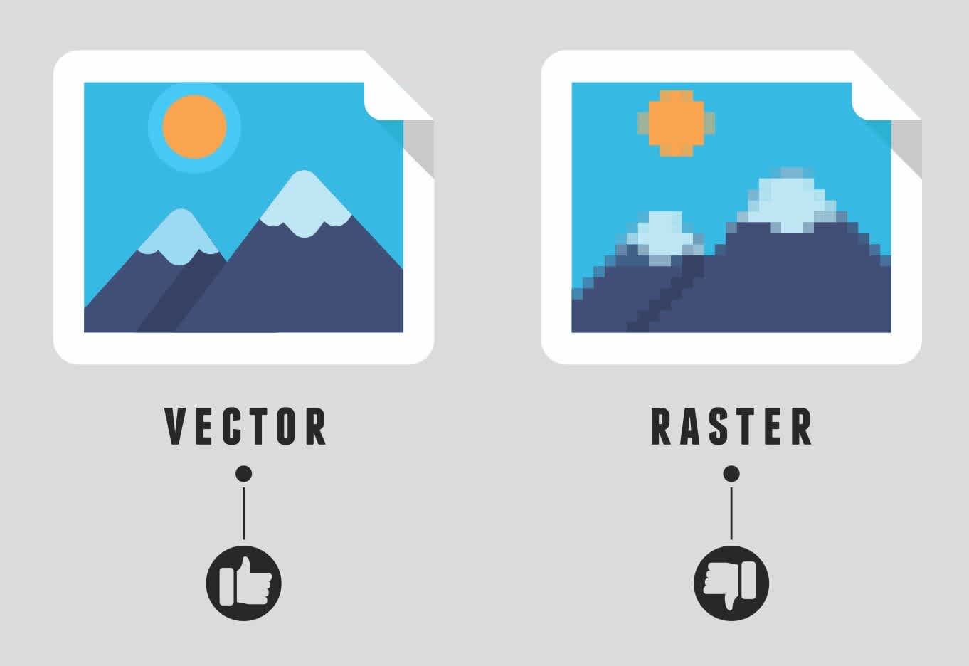
Yes, in minimalist graphic design, illustrations can be incorporated. However, these should be simple and not overcrowded with detail. The intent is to use a minimal illustrative approach to convey a story or concept quickly and directly. To maintain minimalism, one must ensure the illustration adds value to the content message and doesn't distract the viewer's focus from the main subject.
How does minimalist graphic design improve user experience?
Minimalist graphic design can significantly enhance user experience by removing unnecessary elements that might distract the user's attention. Users are presented with only the essentials, making interfaces easier to use and content easier to digest. This simplicity provides clear navigation paths and calls to action, improving the user's ability to interact effectively with the design.
Pros of Minimalist Graphic Design Principles
Emphasis on the Essentials
When it comes to minimal design, less is definitely more. This principle helps designers strip away unnecessary elements and focus on what's most important. It brings an increased emphasis on the core content, message, or functionality of a project, making the design more effective and streamlined.
Time Efficiency
Minimalist designs are usually faster to finish than complex ones. You don't need to spend much time thinking about the inclusion of excessive graphics, colors, shadows, textures, and other embellishments. Simplifying the design process leads to greater time efficiency.
Enhanced User Experience
User experience is the key to securing customer interest and encouraging repeat traffic. Minimalist graphic design principles promote simplicity and functionality, which enhance the user's experience. They decrease page load times, make navigation more intuitive, and make it easier for users to interact with design elements.
Aesthetically Pleasing
Simplicity can be beautiful. Often, minimalist designs have a sophisticated and fresh feel to them. They don't feel cluttered or overwhelming and as a result, they can be easy on the eyes. This makes them particularly effective in catching the viewer's attention and keeping it.
Easy to Update or Repurpose
Since minimalist designs focus on essential elements, they're often easier to update or repurpose. Removing or changing a few key parts won't affect the overall design much. This means that one design can be used across multiple campaigns, or updated for new promotions, saving the designer a lot of time and effort.
Cost-Effective
When done correctly, minimalist designs can be more cost-effective. Less complicated designs often require fewer resources in form of time, money, and manpower. It can make the approval process smoother as well, since there are fewer elements for stakeholders to review and possibly object to.
Cons of Minimalist Graphic Design Principles
Risk of Being Too Generic
There's a thin line between simplicity and plainness. Sometimes, minimalist designs can be too bland or generic, not leaving enough room for creative expression. If not done well, they may be interpreted as lacking imagination or effort.
Difficulty in Expressing Complex Ideas
Minimalism can be a tough sell if the project in hand requires detailed, elaborate communication. The practice of reducing content and visual elements to their simplest form can lead to misconceptions or confusion if the message the design is attempting to communicate is complex.
Potential Lack of Emotional Appeal
Designs that are overflow with personality often stimulate emotional connections, but minimalist design's tendency to pare things back could result in designs that are perceived as sterile or impersonal. This could possibly deter audiences or reduce their engagement.
Requires Precise Execution
Because of the lack of numerous design elements and a smaller margin for error, every minimal design must be executed perfectly to be successful. The precise alignment, scale, and color choices are of paramount importance as slight missteps can greatly reduce the impact of the design.
Doesn't Fit All Brands
Minimalist design is not for every brand. Some companies have established a brand identity that’s playful, quirky, or elaborate and a sudden shift to a minimalist design could confuse customers or dilute the brand's unique persona. Therefore, designers must be aware of whether or not minimalism aligns with a brand's established identity before deciding to use it.
Susceptibility to Trends
Trends come and go. While minimalist design is popular right now, it may not be in the future. Relying solely on current design trends could make your design seem outdated in a few years or may even months. This means that while minimalist design principles could increase appeal in the short term, they might not be a wise long-term strategy.
Summary
So, what can we gather from our exploration of minimalist graphic design principles? Well, first and foremost, it’s about simplicity. Stripping down to the essentials and allowing the core message to shine through. Often, less is more when it comes to making a strong and lasting impression. This design principle allows the viewer to interact with the design more intuitively, without unnecessary distractions.
Embracing minimalist graphic design principles also encourages the use of functional elements that serve a purpose. Each element must hold significance, be that a color, line, or space. This restraint often leads to designs that are clean, balanced, and easy to digest. However, it’s not about creating something plain or boring. With the right knowledge and creativity, minimalism can lead to highly innovative designs that are both beautiful and effective.
Finally, remember that minimalist design doesn't mean absence of creativity or ideas. It’s about making the most of the space you have, using it to highlight your most important elements. Minimalist design demands a keen eye for detail and an understanding of how to create balance and tension with less. So, go ahead and experiment with minimalist graphic design principles, you might be surprised at what you can achieve with them.
About WebPerfex;
WebPerfex is an innovative and dynamic web design and SEO company based out of Roseville, CA. As a trusted friend in the industry, we've made it our mission to design, build, and optimize top-notch websites that help businesses small and large succeed online. We pride ourselves on our versatile expertise and our commitment to staying on the cutting edge of digital marketing trends. Whether you're seeking a stunning new website or looking to boost your visibility in the search engines, trust WebPerfex to propel your business to the next level.


