Minimalist graphic design is becoming the dominant trend in the integrated visual-communication world, pulling in audiences through simplicity and purpose. It highlights the fundamental elements, colors, and shapes, discarding anything superfluous, thus capturing the true essence and brevity of a concept. This blog will delve deep into the world of minimalist graphic design.
Defining Minimalist Graphic Design
Minimalist graphic design is a design philosophy that advocates simplicity by focusing on the essential elements, and removing redundant, non-essential parts. The design outcome by minimalistic approach is streamlined, sophisticated and practical, focusing on the standard rule - 'less is more'.
Birth of Minimalism in Graphic Design
Originating in the 1960s as a form of visual art, minimalism eventually expanded into various fields, including graphic design. Artists and designers desired to strip their work down to the barest elements to show the purity of the art form.
Aesthetics of Minimalism in Graphic Design
Minimalist designs often focus on the following aesthetic elements.
Minimal Colors
Minimalists use a limited color palette of two to three colors. The colors are often neutral, like white, black, or gray, and they tend to be utilized to balance each other out.
Negative Space
The central element of minimalist graphic design is the effectual use of negative space. Designers leave a part of the design empty, allowing the viewer to focus on the essential elements.
Typography
Instead of eccentric fonts with elaborate arrangements, minimalist designers prefer simple, clean, and readable fonts, often in bold weights, to create an impressive visual impact.
Simplified Elements and Forms
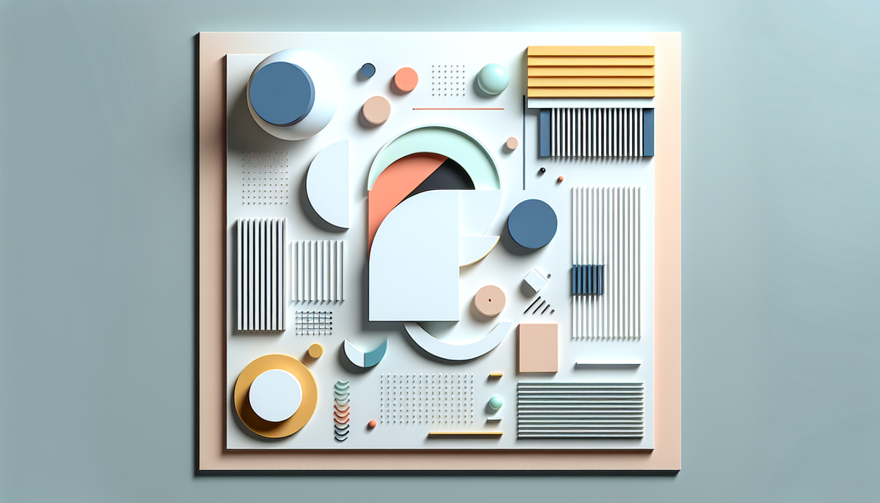
Minimalist designers usually use basic geometric shapes to form more complex designs, keeping the objects as bare and stripped-down as possible.
Fundamental Principles of Minimalist Graphic Design
Minimalist graphic design is more than just using fewer elements or simple shapes. Here are some key principles that dictate the pattern of minimalist graphic design.
- Less is More: The mantra for every minimalist design concept. Designers use a limited number of graphic elements to keep the design simple yet effective.
- Functionality is Essential: Each element of the design serves a functional purpose. There is no room for anything superfluous.
- Focus on Details: As the quantity of elements is reduced, the focus on details and quality increases. Every line, shape, and color should be perfect.
- Visibility and Readability: The design must be easy to understand, with visible elements and readable typography.
Evolution of Minimalist Graphic Design
In the past, graphic design was dominated by elaborate layouts, vibrant colors, and flashy fonts aimed at capturing attention. But over time, people’s preferences evolved. They now prefer simple, clean designs that help showcase the message clearly. This evolution has catapulted minimalist graphic design to prominence.
Impact of Minimalist Graphic Design
Today, minimalist graphic design is found everywhere, from logos and websites to packaging and fashion. Notable brands, such as Apple, have embraced minimalism in their designs. It’s this simplicity that makes the design easily recognizable.
- Logos: Minimalistic logos are clean, versatile, and memorable. They don't sacrifice legibility or impact.
- Websites: Minimalist web design is popular for its clean aesthetics and easy navigation. It improves the user experience by focusing on essential content.
- Packaging: Minimalist packaging design focuses on functionality and simplicity. It conveys the brand's message straightforwardly.
Minimalist Graphic Design in the Age of Social Media
In the era of digital noise, the minimalist graphic design trend shines as an eye-soothing, attention-building strategy. A minimalist social media graphic design makes the subject stand out against endless streams of saturated images and video content, thus creating a memorable brand image.
Frequently Asked Questions about Minimalist Graphic Design
How can I get started with Minimalist Graphic Design?
If you're interested in exploring minimalist graphic design, start by studying some iconic minimalist designs. Try replicating them first to get a sense of balance and proportion. Then, move to creating your own designs. Remember, start with only what's necessary and gradually subtract elements until the message is still clear with only the least amount of components.
Where can I find Minimalist Graphic Design inspirations?
Inspiration for minimalist graphic design is all around us. You can start by exploring design blogs, publications, and forums dedicated to minimalist design. Websites like Behance and Dribbble feature excellent examples of minimalist graphic design. Modern and contemporary art are also great resources for minimalism inspiration.
Why is Minimalist Graphic Design so popular?
Minimalist graphic design has gained popularity because of its simplicity and clarity of communication. It removes all unnecessary elements and focuses solely on the message. This not only enhances the user experience but also makes your design flexible for an array of applications. Thus, it's no surprise that minimalist graphic design has been widely adopted in branding, website design, advertisement, and other fields of design.
What software do I need for Minimalist Graphic Design?
Popular minimalist graphic design software includes Adobe Illustrator, Adobe Photoshop, Sketch, and Figma. While Adobe Creative Suite is an industry standard, Sketch and Figma are excellent options for beginners owing to their intuitive interfaces. Even Canva, with its simple drag-and-drop interface, can be a great tool for beginners dabbling in minimalist design.
I’m a marketer/entrepreneur. Can Minimalist Graphic Design benefit my business?
Absolutely! Minimalist graphic design can be an effective communication tool for businesses. When a design is stripped down to its essentials, it sends a clear, unambiguous message, which can result in higher engagement levels and a stronger brand identity. Also, minimalist designs are typically more versatile and adaptable for different platforms, making them a smart choice for many businesses.
Can I mix Minimalist Graphic Design with other styles?
Yes, mixing minimalist graphic design with other styles can create fascinating, unique aesthetics. For instance, combining minimalism with a touch of grunge textures can create an interesting contrast. Or juxtaposing minimalist elements with hand-drawn illustrations can create a blend of modern and organic vibes. Remember that the blending should uphold the core minimalist principles of simplicity and functionality.
Pros of Minimalist Graphic Design
Simplicity and Clarity
One of the most significant advantages of minimalist graphic design is its simplicity. By focusing on fewer elements, minimalist designs are easier to understand, making them more user-friendly. They avoid visual clutter, making the message they communicate more direct and compelling. This reduces confusion and misinterpretation, making designs more effective in achieving their intended objective.
High Usability
Minimalist designs are typically more user-friendly because they emphasize the essential functions and features of a design. Through eliminating unnecessary components, users can quickly identify and use the core functions provided by the design. This can drastically improve user experience (UX) and satisfaction.
Foster Focus on Content
A primary principle of minimalist design is the emphasis on content. By stripping away decorative elements, the focus remains on the core message or functionality that the design is intended to convey. This allows audiences to engage more deeply with the material, without being distracted by extraneous elements.
Time and Cost Effective
Minimalist design is generally quicker and less costly to produce than more intricate compositions due to its reduced complexity. Reducing the number of elements to design, adjust and test can significantly cut down on production time. This is particularly beneficial in terms of cost control, especially in instances where there's a tight budget or a tight project timeline.
Future-proof
Minimalist designs are often considered timeless. Due to their straightforward and simple nature, minimalist designs are less likely to appear dated or out of style over time. This can give your designs a longer lifespan, reducing the need for regular redesign and updates.
Cons of Minimalist Graphic Design
Risk of Being Uninventive
While minimalist design can look sleek and modern, there's always a risk that it may also look generic or uninspiring. Without additional decorative or creative elements, designs can risk feeling too simple, or 'safe', and lacking a distinctive brand identity.
Perception of Lack of Effort or Complexity
Another disadvantage of minimalist design is that it can sometimes be perceived as lacking effort or complexity. This might make audiences underestimate the value or quality of the product, service or message the design is intended to convey.
Limited Emotional Engagement
Delivering emotional impact in minimalist designs can be a significant challenge, as the scarcity of elements can often restrict the levels of depth or layers of meaning that can be conveyed. This could limit the ability to stir an emotional response from the audience.
Missing Context or Detail
While minimalist designs prioritize simplicity, they can sometimes inadvertently miss out on essential details or context. Designs might become too simplified to effectively communicate specifics or nuances, thereby limiting their overall effectiveness.
Dependence on High-Quality Content
Minimalist designs rely heavily on high-quality content to shine. Without engaging content, such design might seem dull or lacking. This puts pressure on content creators to deliver high-quality content consistently. This can be challenging, particularly for businesses with limited resources or tight deadlines.
Difficult to Execute Well
While minimalist design may seem straightforward, it actually requires a deep understanding of design principles to execute well. Designers must carefully balance elements to achieve effective simplicity without disregarding importance. A seemingly small misstep can result in a design that feels lacking or unbalanced.
To summarize, minimalist graphic design has its own strengths and weaknesses. Its simplicity and clarity can be advantageous, but they can also potentially limit creativity, emotional engagement, and detailed communication. As with any design approach, the key is understanding its principles, opportunities, and constraints, and thoughtfully applying them to meet specific design challenges and objectives.
Summary
Minimalist Graphic Design is all about making the most out of the least. This style values simplicity and efficiency, focusing on essential elements and stripping away unnecessary details. It relies heavily on typography, colors, and shapes, dispensing with distracting embellishments. The aim is always to create designs that are clean, functional, and beautifully simple. In this fast-paced world, it's often a breath of fresh air when we come across a design that's calm, straightforward, and easy to digest.
At its core, Minimalist Graphic Design is a testament to the old adage that "less is more". This design philosophy forces the designer to distill complex ideas and messages into their simplest form. Instead of overwhelming the audience with extravagant or unnecessary elements, minimalistic designs bravely stand on their own, exuding class, elegance, and clarity. It just goes to show that sometimes, you don't need a bunch of bells and whistles to make a lasting impression.
While Minimalist Graphic Design may seem straightforward, it can be quite tricky to execute artfully. It requires a deep understanding of balance, space, and alignment. It's all about creating a perfect equilibrium. Every line, shape, color, and whitespace should serve a purpose. It's not just about removing elements, but thoughtfully choosing what to leave behind. This minimalist approach can be a powerful tool in the hands of a skilled designer, aiding in creating designs that captivate and resonate with audiences without being overly flamboyant.
About WebPerfex
WebPerfex is a dynamic, Sacramento-based web design and digital marketing agency with a flair for the art of designing exciting digital experiences. Hailing from sunny California, we're a dynamic team of creatives that thrive on demystifying the digital world for clients from all corners of business. We specialize in blending aesthetics with functionality and transforming business websites into powerful sales tools. Our experts enjoy nothing better than positioning businesses to thrive in the digital age. Don’t be fooled by the laid-back vibe, though – WebPerfex is passionate about enhancing web performance and driving online visibility!


